About The App
Canfitpro had a customized CRM system built in place because of a very unique way of communicating with its clients and partners within the industry. Continued issues of buggy and outdated user interface, and introducing unique features, lead the company to build the application.
The Goal
The goal was to build an intuitive and enjoyable application that would make it much easier for the customer relations team to organize the information collected from the clients and to find new business opportunities.
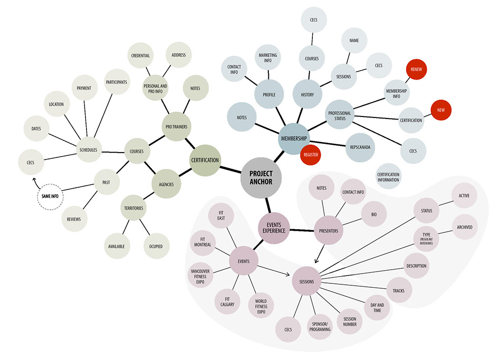
Information Architecture
All the departments, despite their different needs and goals were using the same interface. All of them complained about its complexity and the amount of tools they never actually used, while the tools they actually used were faulty and incomplete. The first goal here was to separate the system in 3 main areas: one for Customer Relations department, one for Certifications, and another for Conference. Then studying what could be suppressed or added to each interface layout.
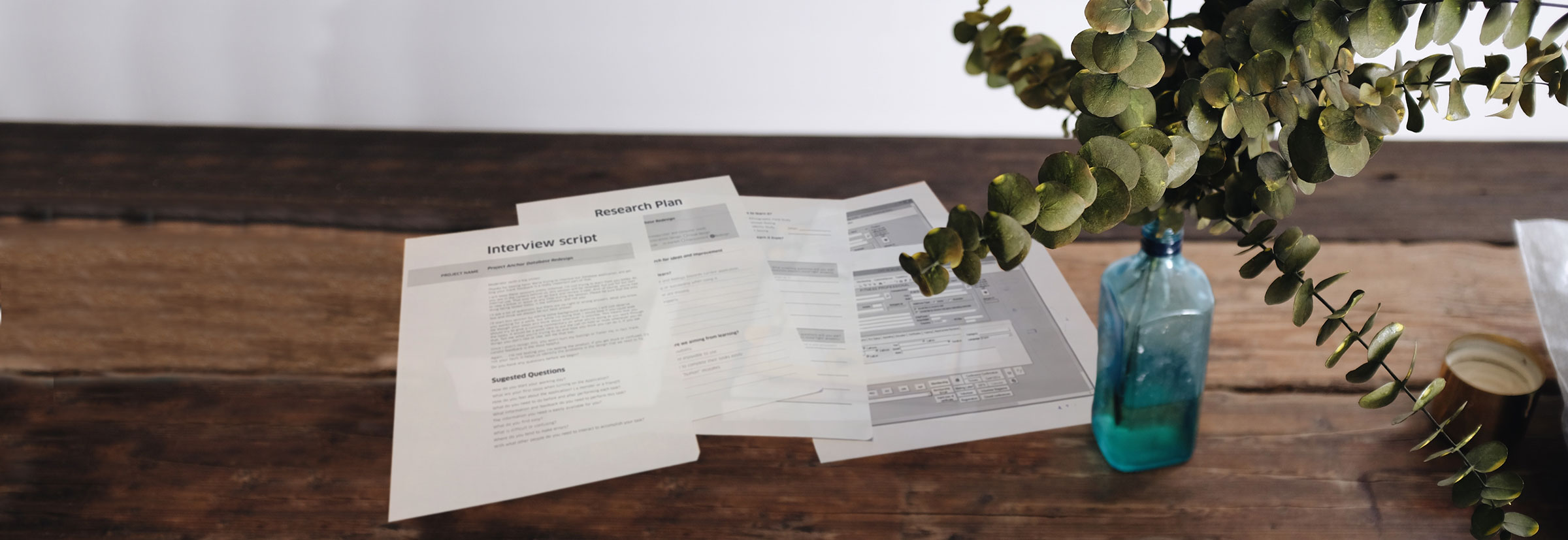
Wireframe / Prototyping
We started with the features we already had because we already had a good idea of which features were being used most also this was good for time to market and sales. We went back and forth with user research and lo-fidelity mock ups as much as we could with tweaks and fundamental rethinking of the features we had. After we got the features and tweaks down, I created Prototypes so the users could get a better feel of the product, it’s UI, and its functionality. Then we proceeded with the new features we wanted to add and the surveying and tweaking the features as much as we could, while keeping complexity for user low and keeping the UI clean.
Visual Design Implementation
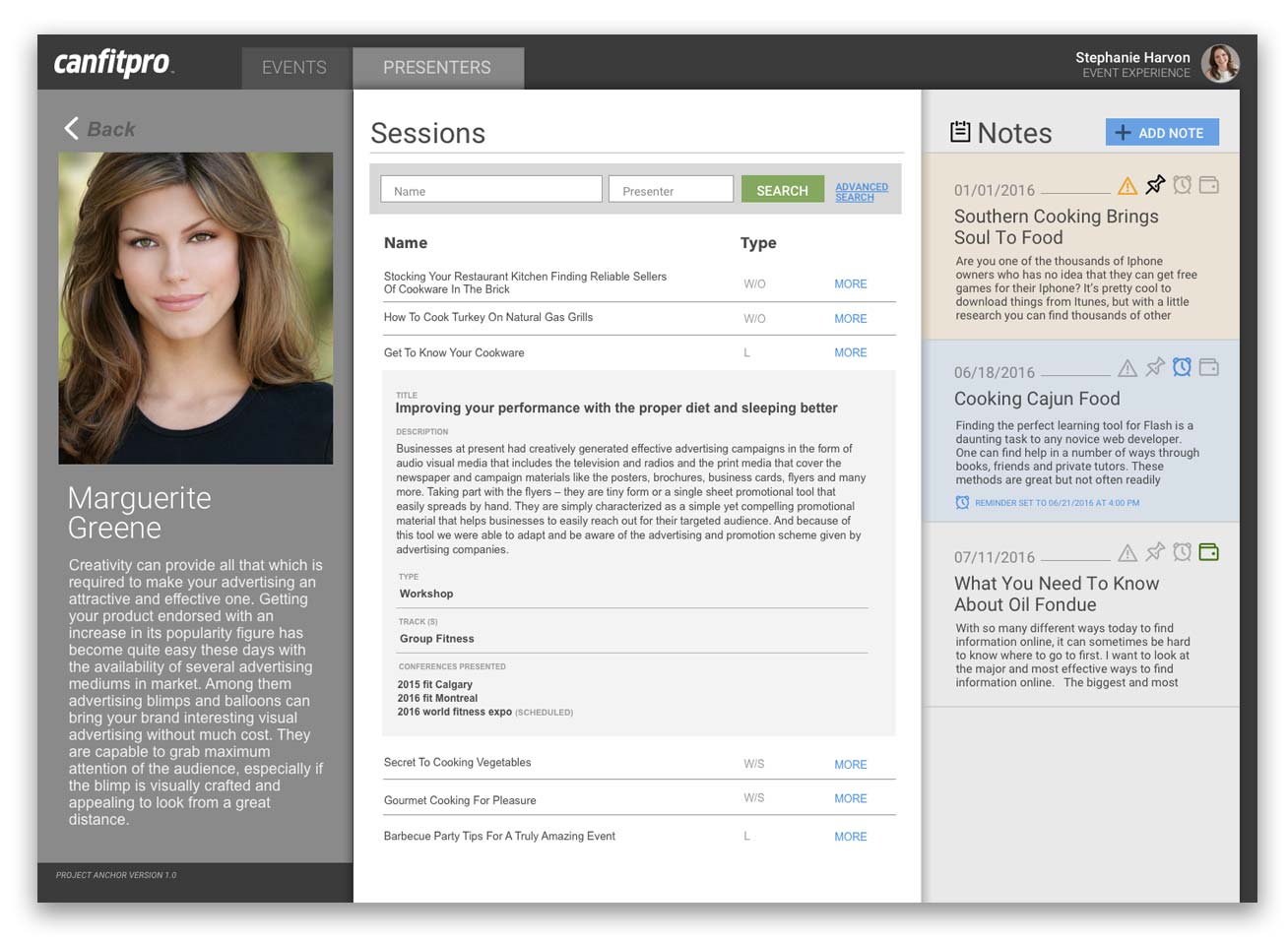
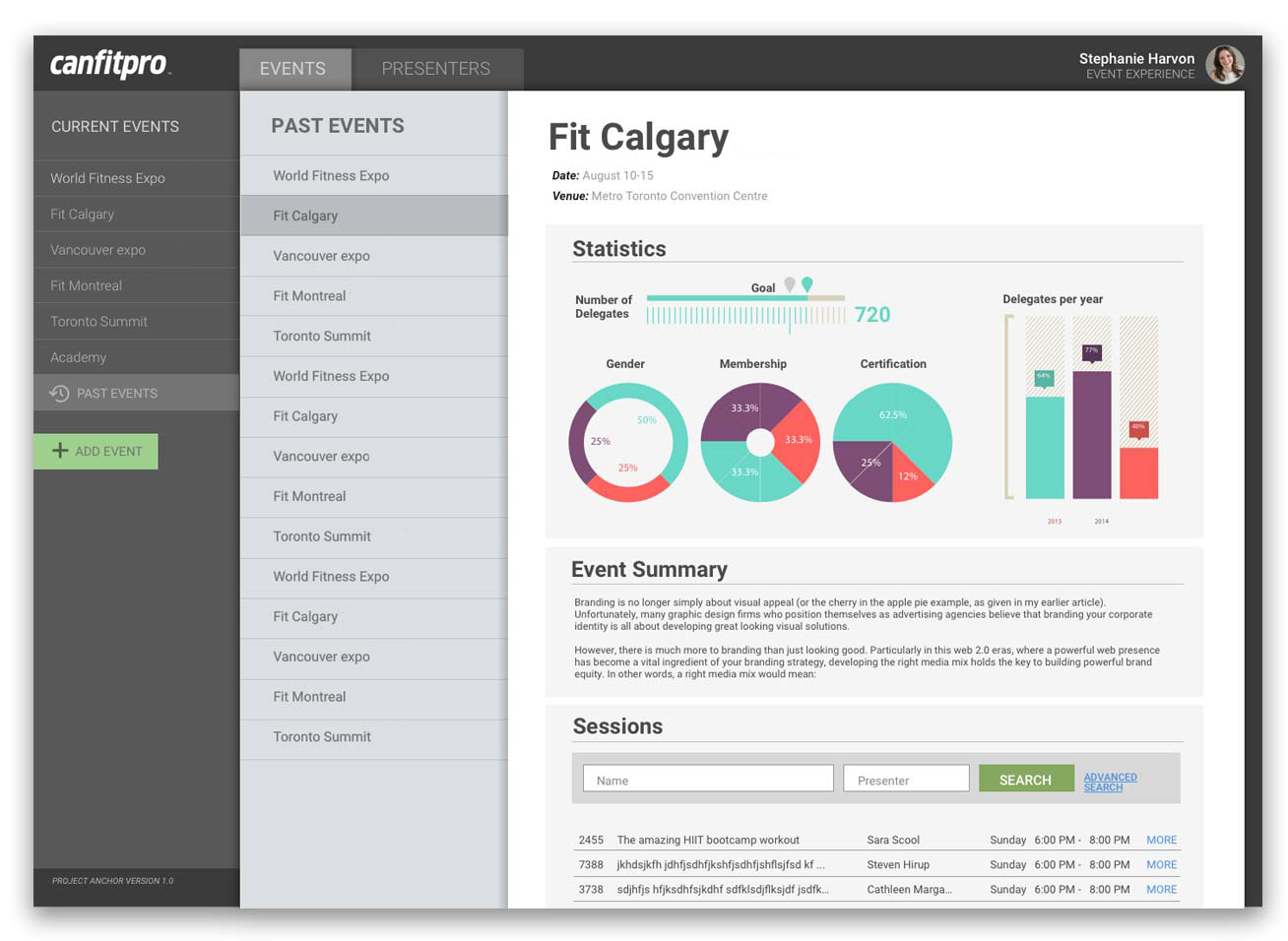
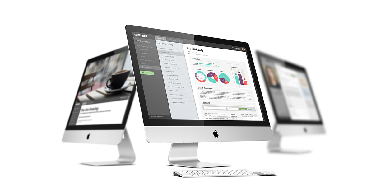
The software was designed having a personality in mind. Creating a personal bond with the user will certainly help to create a better working environment, allowing the user to be more confident and comfortable to use the system. A big welcome screen customized to the time of the day and displaying a feel good image was designed to put the user in the good mood.
“A very intuitive and easy to navigate layout”. This was one of the targets of this project. In the example shown here, the user is in the Events environment; that would be the default working area for people at the Events department. Dividing the user’s interface by department helped make things much more simple and enjoyable to use. The colour and typography will also help the user to navigate easily though the pages.
FACILITIES & ACTIVITIES
Lorem ipsum dolor sit amet, consectetur adipisicing elit, sed do eiusmod tempor incididunt ut labore et dolore magna aliqua. Ut enim ad minim veniam, quis nostrud exercitation.